How to Use the New HTML5 <dialog> Tag
- 810Words
- 4Minutes
- 29 Jul, 2024
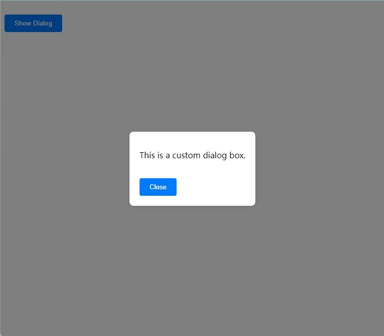
Before the introduction of the HTML5 <dialog> tag, creating a modal dialog on the front-end required considerable effort. It involved writing a lot of CSS and JavaScript and handling various compatibility issues. Here is a simple demonstration:
Simulated Modal Example Code
HTML Part
1<!doctype html>2<html lang="en">3  <head>4    <meta charset="UTF-8" />5    <meta name="viewport" content="width=device-width, initial-scale=1.0" />6    <title>Custom Dialog Example</title>7    <link rel="stylesheet" href="styles.css" />8  </head>9  <body>10    <button id="showDialog">Show Dialog</button>11
12    <div id="dialogOverlay" class="overlay"></div>13    <div id="dialog" class="dialog">14      <p>This is a custom dialog box.</p>15      <button id="closeDialog">Close</button>16    </div>17
18    <script src="script.js"></script>19  </body>20</html>
CSS Part (styles.css)
1/* Overlay for the dialog */2.overlay {3  display: none;4  position: fixed;5  top: 0;6  left: 0;7  width: 100%;8  height: 100%;9  background: rgba(0, 0, 0, 0.5);10  z-index: 10;11}12
13/* Dialog box styles */14.dialog {15  display: none;16  position: fixed;17  top: 50%;18  left: 50%;19  transform: translate(-50%, -50%);20  background: white;21  padding: 20px;22  border-radius: 8px;23  box-shadow: 0 2px 10px rgba(0, 0, 0, 0.1);24  z-index: 20;25}26
27/* Button styles */28button {29  margin-top: 20px;30  padding: 10px 20px;31  border: none;32  background: #007bff;33  color: white;34  border-radius: 4px;35  cursor: pointer;36}37
38button:hover {39  background: #0056b3;40}
JavaScript Part (script.js)
1document.addEventListener("DOMContentLoaded", function () {2  const showDialogButton = document.getElementById("showDialog");3  const dialog = document.getElementById("dialog");4  const dialogOverlay = document.getElementById("dialogOverlay");5  const closeDialogButton = document.getElementById("closeDialog");6
7  showDialogButton.addEventListener("click", function () {8    dialogOverlay.style.display = "block";9    dialog.style.display = "block";10  });11
12  closeDialogButton.addEventListener("click", function () {13    dialogOverlay.style.display = "none";14    dialog.style.display = "none";15  });16
17  dialogOverlay.addEventListener("click", function () {18    dialogOverlay.style.display = "none";19    dialog.style.display = "none";20  });21});
Explanation
-
HTML Part:
- The
#showDialogbutton triggers the display of the dialog. - The
#dialogOverlayis an overlay for the modal effect, making the background unclickable. - The
#dialogis the main body of the dialog, containing text and a close button.
- The
-
CSS Part:
- The
.overlayclass controls the style of the overlay, making it cover the entire screen with a semi-transparent display. - The
.dialogclass controls the style of the dialog, centering it with some styling. - The
buttonstyle controls the appearance of the buttons.
- The
-
JavaScript Part:
- Listens for the
DOMContentLoadedevent to ensure the code runs after the DOM is fully loaded. - Adds a
clickevent listener to the button that shows the dialog, setting thedisplaystyle of the overlay and dialog toblock. - Adds
clickevent listeners to the close button and overlay, setting thedisplaystyle tononeto hide them.
- Listens for the
Effect
The Web Hypertext Application Technology Working Group (WHATWG), the driving force behind HTML5, recognized the need for standardized dialog functionality. In 2013, WHATWG introduced a new HTML element—the <dialog> tag, aimed at providing built-in dialog functionality. Subsequently, the World Wide Web Consortium (W3C) also began considering incorporating the <dialog> element into the HTML standard. The initial specification of this element was defined in the HTML Living Standard and gradually adopted into the HTML5.2 specification. The first browser to support the <dialog> element was Google Chrome, starting with Chrome 37 in August 2014. Other browsers (e.g., Firefox, Safari) were slower to support this element. As of 2023, modern mainstream browsers (e.g., Chrome, Firefox, Edge, and Safari) support the <dialog> element, making it more prevalent in web development.
Basic Usage of <dialog>
- Define the dialog: Use the
<dialog>tag to define a dialog. - Open the dialog: Use JavaScript to open or close the dialog.
Example Code
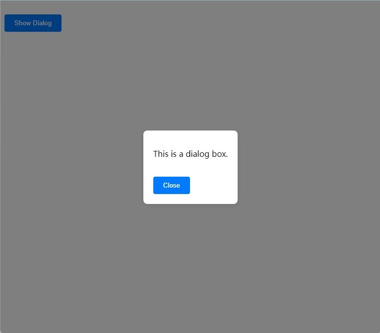
1<!doctype html>2<html lang="en">3  <head>4    <meta charset="UTF-8" />5    <meta name="viewport" content="width=device-width, initial-scale=1.0" />6    <title>Dialog Example</title>7    <style>8      /* Dialog box styles */9      dialog {10        border: none;11        padding: 20px;12        border-radius: 8px;13        box-shadow: 0 2px 10px rgba(0, 0, 0, 0.1);14      }15      dialog::backdrop {16        background-color: rgba(0, 0, 0, 0.5);17      }18
19      /* Button styles */20      button {21        margin-top: 20px;22        padding: 10px 20px;23        border: none;24        background: #007bff;25        color: white;26        border-radius: 4px;27        cursor: pointer;28      }29
30      button:hover {31        background: #0056b3;32      }33    </style>34  </head>35  <body>36    <button id="showDialog">Show Dialog</button>37
38    <dialog id="myDialog">39      <p>This is a dialog box.</p>40      <button id="closeDialog">Close</button>41    </dialog>42
43    <script>44      const showDialogButton = document.getElementById("showDialog");45      const dialog = document.getElementById("myDialog");46      const closeDialogButton = document.getElementById("closeDialog");47
48      showDialogButton.addEventListener("click", () => {49        dialog.showModal();50      });51
52      closeDialogButton.addEventListener("click", () => {53        dialog.close();54      });55    </script>56  </body>57</html>
Explanation
-
HTML Part:
- A button
<button id="showDialog">Show Dialog</button>triggers the display of the dialog. <dialog id="myDialog">defines a dialog containing a piece of text and a button to close the dialog.
- A button
-
JavaScript Part:
- Obtains references to the button and dialog using
getElementById. - Adds a
clickevent listener to the button that shows the dialog, calling thedialog.showModal()method to display the dialog. - Adds a
clickevent listener to the close button, calling thedialog.close()method to close the dialog.
- Obtains references to the button and dialog using
Effect
Modal vs. Non-Modal Dialogs
- The
dialog.showModal()method displays a modal dialog, making the background unclickable until the dialog is closed. - The
dialog.show()method displays a non-modal dialog, allowing the user to interact with the background page.
Customizing Styles
We can customize the appearance of the dialog using CSS. For example:
1<style>2 dialog {3 border: none;4 border-radius: 8px;5 padding: 20px;6 box-shadow: 0 2px 10px rgba(0, 0, 0, 0.1);7 }8 dialog::backdrop {9 background-color: rgba(0, 0, 0, 0.5);10 }11</style>This approach can make the dialog more aesthetically pleasing and user-friendly.
Compatibility
Although the <dialog> tag is widely supported in modern browsers, some older browsers may not support it. For compatibility support, consider using the dialog-polyfill library.